

Key Takeaways
-
Design in advance what floors are going where. Don’t just mix two floor types in one house.
-
Select complementary colors and undertones and stick to a two or three-color palette to help mixed floors feel visually cohesive.
-
Pair materials with room purpose by utilizing water-resistant, rugged floors in wet or high-traffic spaces and plush surfaces in bedrooms and seating areas.
-
Put transitions along natural boundaries such as doorways, run plank or tile direction along sightlines, and compensate with rugs or transition strips to ease the visual transition.
-
Handle height differences with subfloor prep, reducers, or ramps for tripping-free, durable, level joins.
-
Stick to two or three types of flooring within one home, skip the awkward seams or mismatched scales, and always opt for combinations that will withstand the test of time to safeguard resale value.
For the record, by mixing two flooring types in one house, I mean having different types of floors in different rooms of a house. Homeowners have long paired hardwood with tile or vinyl as a way to match function and style while keeping costs low.
The good mixes employ clear transition strips, consistent color tones and sensible room selections such as wet areas for tile and living areas for wood. Below, the remainder of this guide offers layout advice, material pairings and installation considerations for a unified outcome.
The Core Principles
Combining two kinds of floors in one home demands a solid scheme and an eye for both aesthetic and functional details. Begin with a general home map indicating what floor goes where. Then impose core design principles to maintain cohesiveness and safety.
1. Unify with Color
Use colors that collaborate, not battle. Use similar undertones—warm or cool—when pairing wood and tile so the tones read as related. Limit the palette to two or three main colors across floors and follow the 60-30-10 rule: 60 percent dominant, 30 percent secondary, and 10 percent accent.
Make a swatch list and hold samples next to each other in the same light as your installation location. Light variations affect color hues and changing bulbs may be the fix for mismatches. Big patterns should be used sparingly, one at most, per room, lest a space feel cluttered.
2. Consider Function
Match fabrics to wear. Think hard, waterproof floors like tile or vinyl for kitchens and bathrooms, and softer floors like carpet or cushioned laminate in bedrooms and lounges for coziness. Select hard-wearing, scratch resistant options for busy hallways.
Luxury vinyl or engineered hardwood are good bets. Limit yourself to two to three materials throughout the home to keep the look purposeful. For instance, wide-plank hardwood in the sitting room and wide-plank vinyl in the nearby hallway keep things flowing while satisfying varying requirements. Consider temperature and foot feel in material selection.
3. Create Flow
Line seams and transitions up with sightlines, doorways and room openings so changes come off intentional. Maintain plank or tile orientation uniform where you can to link spaces visually, particularly in open plans.
Area rugs are the perfect way to connect surfaces and smooth edges with an additional focal point. Don’t make flooring cuts in the middle of a sightline. Use walls, built-ins or a change in ceiling plane as your logical boundary.
4. Define Spaces
Use different floors to zone open areas: tile can anchor a kitchen work triangle while wood cushions the living area. Emphasize breakfast or reading nooks with a contrasting finish or rug.
Define edges crisp with a single trim piece or transition strip. Juxtapose textures, matte stone next to satin wood, to define every area with a strong sense of intent and no confusion.
5. Mind the Height
Gauge thickness and prime subfloors so transitions are secure and clean. Plan for transition strips or small ramps to smooth over height differences and avoid trips.
Good subfloor work makes it last and look seamless.
|
Principle |
What it affects |
Quick action |
|---|---|---|
|
Color unity |
Visual harmony |
Match undertones, use 60-30-10 |
|
Function |
Durability, comfort |
Place water-resistant floors in wet areas |
|
Flow |
Visual continuity |
Align seams, keep plank direction |
|
Definition |
Space purpose |
Use contrasting materials or rugs |
|
Height |
Safety, finish |
Prep subfloors, use transition strips |
Material Pairings
Pairing materials weaves in those same decision points, especially when mixing flooring types, which calls for thoughtful decisions about tone, texture, and transition. Think about the eye flow from room to room, the functional requirements of each space, and where materials will physically come together.
Try to keep materials in a warm or cool family, repeat at least one material somewhere else as a visual link, and restrict visible types to two or three to avoid cluttered sightlines.
Pair hardwood with tile for that timeless kitchen and foyer combo. Hardwood adds warmth and texture. Tile stands up to spills and heavy traffic. For example, wood in the main living areas and tile in the kitchen work zone or entry are areas where water and grit accumulate.
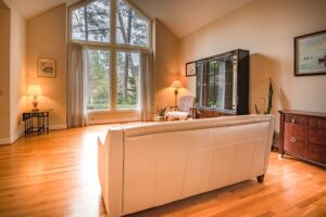
Match undertones: a warm oak pairs well with cream or terracotta tile that shares warm undertones, while cooler gray oak fits with slate or porcelain in cool grays. Use a transition strip where heights vary or tile meets a bare edge. A flush mortar or a slim metal profile goes well for hardy, clean joints.
Repeat the hardwood on a stair tread or island face to connect the two materials. Pair carpet with laminate or vinyl in bedrooms and hallways for comfort and simple care. Carpet provides softness and a sound barrier, while laminate or luxury vinyl is easy to clean and wear resistant.
Maintain carpet color and pile at a moderate level so it balances the laminate’s grain and tone. Lay carpet in sleeping areas and vinyl in connecting hallways or closets. A brief, minimalist threshold frequently works well between soft and hard materials.
When turning corners or changing floor heights, install a small ramp or a reducer strip to satisfy code and create safe transitions. Combine stone or ceramic tiles with wood floors in high-traffic areas for both style and functionality. Use tile at doorways, mudrooms, and kitchens where grit, moisture, and wear punctuate.
Use wood for living and dining. Select tile sizes and grout colors that reflect the wood’s undertone. Large format tile minimizes grout lines and smooths the transition into wood. For floating wood floors next to tile, ask an installer about how to provide the appropriate movement joints so it does not buckle.
-
Hardwood and tile are best for kitchens, entryways, and laundry rooms. They match undertones and use transition strips for height changes.
-
Carpet and Laminate/Vinyl are best for bedrooms and hallways. Comfort and care come first and foremost. Utilize reducers as necessary.
-
Tile and wood are best for high-traffic or wet zones adjacent to living spaces. Match grout or tile tone to wood undertone. Receive installer tips for floating floors.
-
Vinyl and wood or tile are versatile in basements and bathrooms. Choose vinyl that imitates wood tone or tile grout to link areas.
-
Stone and hardwood create a strong visual contrast for foyers or kitchens. Echo a wood tone on trim or stairs to connect spaces together.
Seamless Transitions
Seamless transitions enhance the flow and retain materials securely at the junction of two flooring types. Try to plan transitions at natural points such as doorways or where room function changes to give a clean professional finish and help visually delineate spaces without having a harsh break. Thresholds where one floor stops and another starts are intentional signifiers.
Selecting thresholds that complement both finishes maintains continuity and complements open-concept or high-end styles.
Transition Strips
Use transition strips where two flooring types meet to cover seams and protect edges. Apply strips at doorways, kitchen thresholds or room entrances to provide a crisp separation and reduce edge abrasion.
Go with a shade and material that coordinates with both surrounding floors for a cohesive appearance. Metal, wood, or vinyl strips function best based on the floors, such as brushed aluminum strips with tile and engineered wood and oak T-molding with hardwood and laminate. Match tone and texture when you can.
Choose T-molding, reducers or threshold strips depending on height variations and material. T-molding transitions level heights, reducers ease a floor that is just a bit lower, and solid thresholds provide a durable edge between tile and wood. Secure fastenings and proper adhesive discourage shifting and keep seams smooth.
Put strips where transitions of traffic, moisture, or function take place. We’re talking kitchen to dining, hallway thresholds or where a living room meets a foyer. Tastefully positioned strips offer utility and understated panache.
Material Inlays
Inlays not only add visual interest, but serve as transition markers without bulky hardware. Set a tile border into hardwood to frame a foyer, or inlay a stone strip between kitchen tile and living room wood to mark a transition.
Design forms and dimensions appropriate to room scale and to prevent visual overcrowding. A slender inlay band fits teeny rooms. A wider, geometric field plays in major spaces. Design details. Coordinate color and finish so the inlay reads as part of the whole floor rather than an afterthought.
Use inlays to bring attention to a zone – seating area, entrance, etc. They can attract attention, direct flow, and support design purpose as they connect various surfaces. Put in with care so edges butt and grout or finish work is uniform.
No Transition
Go for a no-transition if floors are similar in height and material performance. T materials directly together with tight seams for a near-invisible join. This technique works well for similar types such as laminate and vinyl or engineered and hardwood when sliced and installed accurately.
Make sure your subfloor is level and installation is precise to minimize shifting or gaps. Small misalignments are more evident in a no-transition join, so save this type for instances where installers can achieve close tolerances.
Seamless transitions A clean, transition-free line can elongate a continuous look that is perfect for open plans and luxury interiors.
Common Pitfalls
Combining two floorings can be both interesting and functional. It opens the door to design and technical errors. Here are the most common pitfalls to avoid, with concrete examples and actionable advice to maintain intentional transitions and a cohesive overall scheme.
Too Many Types
Limit your flooring selection to two or three varieties for the entire home. Employing more than three materials usually evokes a patchwork and noise that disrupts it. Choose a dominant material for around sixty percent of the scheme, a secondary for thirty percent, and an accent for ten percent.
-
Hallway is designed with oak boards that are 15 mm thick and have a warm brown undertone. It links the living area and the bedrooms.
-
Living room is oak with 180 mm wide planks and an undertone to the hall. It is the primary zone with 60% coverage.
-
KITCHEN — 300 x 300 mm porcelain tile, matte finish, cool gray undertone. Robust wet-zone material.
-
Bathrooms — smaller mosaic or 150 by 150 millimeter tile that reflects kitchen color but has a slip resistant finish.
-
Utility room — vinyl or linoleum in matching neutral for easy care and moisture resistance.
Don’t scrap parts from old projects. Leftovers hardly ever match scale, finish or undertone and cause inconsistency. Avoid last minute mismatch by sticking to a punch list with every room’s material, color code and care requirements.
Awkward Lines
So, instead, align floor transitions with architectural elements like doorways, walls, or built-ins. This is what makes lines feel ‘designed’ or intentional. Seams in the middle of open areas tend to look haphazard and unprofessional. Instead, align transitions with natural doorways or anchor a transition with a rug.
Use direct, clean lines or soft curves. Jagged or diagonal cuts across sightlines emphasize and disrupt flow. Plan transitions during the design phase. Specify the type of transition strip, height differences, and whether to use a threshold or inlay.
Consider traffic flow and natural zones. For example, a seam that crosses the main circulation path at an odd angle will show wear faster and look awkward. Think about maintenance compatibility too. Differing upkeep needs should not meet in high-use areas.
Ignoring Scale
Match plank width, tile size and pattern scale to room size in order to keep proportions balanced. Huge tiles in a tiny bathroom are claustrophobic. Small planks in a big open-plan space can appear fussy and cluttered.
Don’t mix undertones in materials. Warm or cool bases that don’t match look awful together. Think about transition strip width and inlays so that they fit the room size.
Recommended sizes by area:
-
Small bathrooms (less than 5 square meters): 150 to 300 millimeter tiles or 90 to 120 millimeter planks
-
Medium rooms (5 to 20 square meters): 120 to 180 millimeter planks or 300 to 600 millimeter tiles
-
Large open-plan spaces greater than 20 square meters require planks that are 150 to 240 millimeters wide or large format tiles up to 900 millimeters.
The Resale Factor
Try mixing two types of floors in one house and see what buyers think of it and how it shifts its market appeal. The resale factor includes more than just good lookin’, but perceived quality, flow, and practicality. Purchasers can be drawn to a home that feels move-in cohesive, so think about how selections will read to a broad audience of future buyers prior to committing.
Go with statement floor combos that are timeless and have universal appeal to buyers. Classic combinations, such as hardwood or engineered wood in living areas paired with neutral stone or porcelain tile in kitchens and baths, tend to stand the test of time. Lighter oak tones with warm gray tile set a tone of wide appeal. Wood look-alike vinyl plank can play nice with tile if the hues are similar and the grout lines are minimal.
Avoid finishes that date a home quickly, like ultra-high-gloss woods or heavily ornamental, textured tiles. Timeless selections allow buyers to envision their own furniture and thus lower cognitive hurdles to purchase.
Steer clear of super trendy or bold flooring combos for resale purposes. Eye-catching tiles, checkerboard patterns, or mixed plank directions can be a polarizing factor for buyers. What is hot today may be hated in a few years. A blend that feels like a purposeful, understated contrast—medium wood tones with light stone, for example—maintains appeal without teetering into specialty appeal.
Some pros argue that too many flooring types are a turn-off. Limiting yourself to two or three consistent materials is good old-fashioned “rule of three” stuff and it minimizes buyer hesitancy.
That’s just one of my cheap filler-enhancer secret weapons. Seamless transitions, the right thresholds, and matched heights stop the cheap look. Install matching material and color transition strips or opt for flush installations where possible. Sloppily executed joins denote a rush job and can cause buyers to incorporate repair costs.
Examples include a tapered hardwood-to-tile seam with a thin brass or wood strip and a flush waterproof membrane between vinyl and tile in wet areas.
Display a flooring plan to make it easier for buyers to imagine a one-floor view of a move-in-ready home. Use a small palette and repeat materials in important sightlines to generate flow.
No, don’t photograph or list flooring types in marketing materials so buyers have some idea of what to expect. By limiting yourself to two or three types of flooring, you strike a nice balance between variety and cohesion. You get the character without driving the ‘I want it all the same’ kind of buyer bananas.
The resale factor is a tough one because it really hinges on local market tastes and buyer profiles.
A Personal View
Starting to mix two flooring types is having a definite sense of how you live and what you want each room to feel like. Pick materials that suit daily use: hard-wearing tile or stone for wet zones, warm wood or resilient vinyl in living areas, and soft textiles for bedrooms. Consider upkeep as well as acoustic and heating comfort.
In a hectic family kitchen, large-format porcelain tile could be used around the sink and range, then transition to engineered oak at the island and dining area to encourage lingering and warmth. Stay true to your schedule so surfaces function, not just appear flashy.
Select floors to create atmosphere in a room. Cool, low-reflective stone or gray porcelain reads calm and modern. Mid-tone or honey wood comes across as warm and invitingly rustic. Aim for a narrative: the entry can feel bold with patterned tile, to warm the main living area with wood, and a neat study with neutral sheet vinyl.
Area rugs can be used to soften transitions and to frame seating zones without switching materials underfoot. Rugs allow you to maintain a hard floor for durability but introduce texture and color where you desire.
Find the middle ground between self-expression and a coherent whole. Restrict visible varieties to two or three over any extended line of vision. When you view the foyer, kitchen, and living room together, too many floor shifts will appear busy.
Stay within one undertone family — warm (yellow, red) or cool (blue, gray) — instead of blending both unless you’re intending for deliberate contrast. Matching undertone matters more than exact color: an ash wood and a cool gray tile can sit well together if both read cool.
Echo a material as a visual link, either the same wood on a stairway or as a slim threshold strip in other locations. Design rational change points instead of chopping mid-room. Natural thresholds are doorways, half walls, a kitchen island or change in ceiling height.
Employ architectural, not accidental, transitions. For example, run tile under cabinets and to an island, then abut wood at the dining edge, or carry wood up a short set of stairs to indicate a change in level. Decorative borders, thin metal strips, or trimmed insets can make the join feel purposeful.
Look to real homes for ideas: a loft that pairs concrete-look tile with warm plank flooring, a coastal house using whitewashed wood and natural stone, or an apartment that uses patterned tile at the entry and the same wood tone in living areas. Read up on them and tweak details to your scale and climate.
Conclusion
When done with care, mixing two floor types can lift a home. Choose combinations that blend in color, height, and wear. Go with crisp lines or intentional transitions at doorways and halls. Remember patterns and grain directions. Try for flow between rooms so the eye can move without breaks. Consider maintenance and wear in the long term. Quick tests in actual light tell us so much. For a daring statement, pair warm wood with cool tile and insert a skinny metal or wood trim. For quiet rooms, keep it tight in color and grain. Check with a pro for level issues and for underlay options. Dare to mix in your own home? Begin with samples in the real rooms and lay out a test pattern.
Frequently Asked Questions
Can I mix hardwood and tile in the same room?
Yes. Whether with a transition strip or a grouted-in design. Try to match height and finish. This produces a hard wearing beautiful look while keeping maintenance straightforward.
What is the best way to hide height differences between floors?
Put a reducer, a transition profile properly sized to the difference. Good underlayment and subfloor leveling before installation reduce gaps and tripping hazards.
Will mixing floors lower my home’s resale value?
Not so fast. Deliberate, well-integrated pairs can drive desirability. Stay consistent on color tones and get it professionally installed if you want to protect resale value.
How do I choose compatible materials?
Match wear levels, moisture tolerance and thickness, etc. For instance, engineered hardwood plays nice with tile. Luxury vinyl mixes with stone and wood-looking floors.
How do I create a visual flow between different floors?
Add a unifying color, trim, or repeating pattern. Match grout lines or plank directions to lead the eye and make transitions feel deliberate.
Are there common mistakes to avoid when combining floors?
Yes. No sudden style clashes, mismatched heights, and no stupid DIY transitions with no tools. Shoddy transition details look gaudy and don’t last as long.
Do different floors need different cleaning routines?
Yes. Clean each according to its care requirements. Use the right cleaners, do not flood wood with water, and seal tile grout. You will go a long way toward prolonging the life and appearance of your floors.